Thursday, May 28, 2015

Art III Final Blog Post

Throughout this piece (on left), I collaborated with my classmates. During the planning phase of the project, I frequently asked my tablemates, specifically Claire and Alex, for advice on how to make this piece the best that it could possibly be. For example, I was not sure what to do after I did a "test-run" for the piece and the paint from each section bled into the white area. Then, Claire suggested that I paint the entire piece of cardboard white before beginning the piece. That way, when I went back to fix up little errors where the paint bled, the white would match the background perfectly. My classmates encouraged me to push through and keep working hard at the project, even when it got extremely tedious and a bit boring. I am thankful to have collaborated with them because if I had not, I do not believe the piece would have turned out as well as it did. I believe that peer collaboration, in any subject matter, is beneficial. Just having two sets of eyes on a work can be useful by decreasing the chance of making silly mistakes. It is great to be in an environment of encouragement and support.
The next piece, my text art piece, is, in my opinion, my most successful. It won third place in the Halle Art Show in the category of high school artists. This is a very original piece of art. I used ideas that I found on Pinterest to come up with the idea of using many words to create shapes. Then, unlike the pieces I had seen on Pinterest, I decided to take my own spin on it by incorporating a serious meaning into what is usually seen as a lighthearted medium. After deciding to do the New York City skyline, I was conflicted between doing the positive or negative words associated with the city. The deciding factor proved to be that I could not come up with enough positive words about it. Don't get me wrong, I've visited NYC and definitely enjoy being there, but city is the epitome and embodiment of the greediness in the United States. I came up with a huge list of words (each word on the piece is different) and then arranged them. The picture to the left does not show it well, but I used different fonts and text weight to draw the reader's eye across the picture. Also, the words in each building are going in a different direction, so it is obvious where the building begins and ends. I believe that this is an extremely unique piece because I had to be innovative and creative in order to make it come together. Also, the subject matter has real meaning and the audience is able to connect with it in order to understand my purpose.


If I were to redo any of my projects, I would redo my last one: my picture of North Carolina. I love the idea of doing a piece to represent my roots and the place I've been raised in. However, I did not give the process of this piece enough thought before I actually began working. I initially spraypainted the background black, traced the phrase "DON'T FORGET WHERE YOU BELONG" and then painted the letters in with yellow. Once I finished doing that, it was missing something. There was too much space around the western side of North Carolina that I needed to fill. So, I decided that I was going to paint over the background in red, white and blue, because those are the colors of both North Carolina's flag and the flag of the United States. I began alternating red, white and blue in strips along the western part of the state, but it looked absolutely dreadful. Now, I think that I need to start over 100%, so I am painting over the whole thing in black so I can start with a blank canvas. I think that I am going to try the text again, because I liked the meaning of it, but I am going to play with the fonts some so that it fills up more of the space. Also, I will not use yellow because it was too difficult to make the yellow strong enough to stand out from the black background.

Thursday, April 30, 2015

Teens Inspired

For my Artists Inspired piece, I was influenced by this work of Frank Philip Stella. Stella has always been one of my favorite artists and I jumped at the opportunity to take a unique spin on his modern style. I really like his use of geometric shapes and clean lines to create a piece with unity and cohesion. Stella's work"Raqqa II" inspired me to create my piece. I laid down strips of masking tape in order to divide up the piece of cardboard into sections. Then, I painted each one of the sections a specific color, which I had previously planned. Each color was placed where it would create contrast between the darks and lights and the warm and cool colors. I had to paint each part several times in order to get the colors to be as rich and pure as I wanted, but I think the extra work was worth it. I'm extremely pleased with how this project came out because the lines are clean, like those of Stella, and the colors go very well together. Other artists who are featured in the North Carolina Museum of Art, including Richard Diebenkorn and Franz Kline, also inspired me with the idea for my piece. 

Monday, April 20, 2015

Art Snapshot 3

I am currently working on an acrylic paint project. I am creating an abstract piece. Once I am done, I'm going to remove the tape so white lines are on the page. The lines are going to draw the eye of the audience from one part of the piece to the other. I'm super excited about this piece and cannot wait for you to see the finished product!!(:

Thursday, February 12, 2015

Art Three Blog Snapshot #2

Since my last blog post, I have completed the text art project. I ended up putting down a layer of newspaper on a canvas, painting over it with grey acrylic paint, and then creating the NYC skyline out of text. I chose this theme because although I love New York, most people who live there are more concerned with making money than with finding true happiness. I'm very pleased with how this piece came out. Taking my time and paying attention to detail ended up paying off with the final project. If I could do this project again and do it differently, I would make more important words bolded. Also, I would buy some better pens so the quality of the piece would be a higher quality.

For my next project, I decided to do printmaking. So far I have created a Pinterest board: 
https://www.pinterest.com/hannahdayy/printmaking/
Also, I have started to create some sketches for my final project.  I decided that I was going to do three prints of the stages of life a girl goes through: childhood, parenthood and old age. I am going to keep the prints very simplistic and only do black and white because I don't want crazy colors to take away from the theme of the piece. 

See you in two weeks!

Tuesday, January 27, 2015

Text Art

For the Digging Deeper Step I created a Pinterest board. The link is below:
http://www.pinterest.com/hannahdayy/text-art/

My first Challenge was a heart comprised of the words "I love you" in many different languages. I really liked the idea of this because if you look closely at the words, many of them are extremely similar. I made English bold so the audience could understand what all of the other words mean. 
My second challenge was the black out text. The picture is hard to read but I chose words like "fight," "dark" and "enemy." 
My idea for the final project is to create the NYC skyline out of words describing the ideals of many business people.  I will be using pen and ink over newspaper.

Thursday, June 5, 2014

Mixed Media: Simplicity and Amusement

The flower was a creative and unique piece of artwork. When I was searching on Pinterest for inspiration, I found a flower with things in each of the petal and was inspired to create this piece. Despite that, I used my own ideas for what to put in each of the petals. I made this piece unique to me because instead of just putting basic patterns or designs in each of the petals, I made each an individual collage of things I like including music, swimming, family, food, and inspirational/motivational quotes. Furthermore, I took the idea I found on Pinterest and incorporated into both of the themes of simplicity and amusement. It displays simplicity because the flower is a simple sunflower and amusement because I included all of the things that I enjoy.
In order to complete this project, I had to learn new techniques and processes. Prior to this project, I had never done a true "Mixed Media" project. I had done simple collages in elementary school art classes, but I had never used gel medium, wallpaper, newspaper, buttons, watercolor, or acrylic paints in one piece or even on their own. Combining all of these techniques was a daunting task, but with Ms. Rossi's help, I believe that I succeeded. Using the gel medium for the first time was an awesome experience and I think that technique helped to pull this piece together. Also, it helped me layer the picture so there is an obvious background, middleground, and foreground. Cutting out images from magazines was another successful technique I used in this piece because they have a nice shiny appearance and have vibrant colors. Overall, I am pleased with the techniques I used to create this piece.
Several times throughout this project, I took a step back in order to reflect on my picture. The first time I stepped back to reflect was after I thought I had completed the petal with the ocean/swimming theme. At first this petal was just the water and the sand with nothing else on it. After reflecting on the petal, I was able to realize that by adding life to it (the dolphin) it would make it more interesting and aesthetically pleasing. I reflected many other times throughout the project, but the final time was at the very end. At the beginning of the project I had drawn in with pencil where I wanted to place the petals, but at the end the pencil marks were still visible. By stepping away from the project and using problem solving skills, I was able to cover up the pencil marks with more pieces of newspaper. After making that correction, I was able to complete my mixed media piece.

Wednesday, May 14, 2014

Painting: Sticky Situation

References
References
Practice with Value/Paint


Final Sketch
Final Product
This sticky situation project was my best piece of work so far because of my creative idea. The inspiration for this project was the pictures (seen above) that I found on Pinterest. Those pictures gave me a basic idea for what I wanted to do, but I expanded on it with the various designs and color schemes used. This idea is original in the sense that it is both relevant, but also very unique.

This piece of art proved that I am able to solve problems. Throughout the final portion of this project (the painting), I made many mistakes. I found things that some of the ideas I had envisioned were not going to turn out perfectly because of both the tricky medium and my lack of experience with it. Instead of getting down on myself and trashing the piece, I decided to reinvent the idea and take some risks that ended up paying off. Using paint was good to help solve little problems because it can be easily layered and covered.

I think this piece accurately portrayed both my skill set and my artistic flair or sense of style. This painting was not meant to have a pressing or controversial tone. I enjoy creating art that is relevant to modern culture and reaches a wide audience. Also, I personally find it more pleasurable to create pieces that are simple, but still represent my personality. When I first saw pictures of the candy lips and demos of how to recreate them, I was intrigued. I loved being able to show my brighter side with the vibrant color scheme and fun concept.


Wednesday, March 26, 2014

Up Close and Personal Project

Tomatoes
I encountered many obstacles in the Up Close and Personal Project that pushed me outside of my comfort zone. First off, I had trouble drawing the basic shape of a tomato in my thumbnails because they are irregular and unconventional. This was discouraging and I thought I was going to have to scrap the entire idea, but I kept trying. Secondly, I found it hard to work so slowly with the colored pencils. I am extremely glad I did though because my piece turned out to be just how I originally imagined it. I responded well to the challenges of this project because I didn't give up easily and I stayed positive.

This project was the first time I ever thought to step back and reflect on my piece. Seeing the piece from a different perspective was eye-opening because I was able to see the areas which needed to either be darkened or lightened. In addition to that, analyzing each tomato helped me to be more successful in the next one. Before this project, I considered how the colors of a tomato would work together. I practiced blending the red, orange, and yellow colored pencils before embarking on my final piece seen above. That exercise proved to be an advantage because there was little banding or obvious separation of the colors.

My table-mates were an amazing source of positive and constructive feedback during all stages of this project. Before starting the final piece, they helped me in the brainstorming phase and to narrow down my ideas to the two best ones. During the project, they offered encouraging sentiments that kept me motivated to work to the best of my ability. I feel that I was also a strong supporter for my peers in their pieces. On several occasions, I praised my classmates and revitalized their excitement.

Tuesday, March 11, 2014

Exploring New Mediums

Sprite Can: Oil Pastel 
Lollipop: Colored Pencil
Before beginning the Up Close and Personal Project, we explored several mediums: oil pastel, chalk pastel and colored pencil. The first mini project we did was the soda can using oil pastel. I am fond of working with oil pastel because the smooth lines it creates. My main struggle with oil pastels was pushing the lights and darks because I felt like all of the colors just ended up blending together. There is not great contrast because most of the blue values are  too similar. Overall, I was satisfied with my can because I think I did a commendable job at making it look realistic, but I did not love it. Going into the second project, I was hesitant about working with colored pencils. I never knew how much contrast one can create using this medium. The opportunity to use Prismacolors for the first time was very exciting because  I liked being able to blend the colors and make the whites stand out. I think my lollipop was the most successful out of the three projects because I created a shadow, highlighted the lights, and it looks like a real lollipop. The final project was a candy in a wrapper using chalk pastel. I like the way that the candy itself looks because of the smooth transitions between values of blue. Despite that, I struggled with my hand smudging the paper and it ended up looking messy. Also, I did not end up liking my choice of using light pink paper because the white of the wrapper was not able to stand out to create contrast. The candy in the wrapper was my least favorite project because I found chalk pastels difficult to work with. Although some like blending the colors with their fingers, I feel like it made my project look more messy. These projects helped to prepare me for the Up Close and Personal Project because I paid attention to small details. In addition to that, I plan on doing either bacon or sliced tomatoes, so I needed some practice with drawing foods. If I could add anything to these projects, I would draw deeper shadows. 
Candy in Wrapper: Chalk Pastel

Tuesday, February 25, 2014

Scientific and Contrast Drawing

Volcano Pen and Ink Drawing
When I first heard the word scientific, I thought of beakers, test tubes, and things you might find in a laboratory. As I thought about it more, I realized that I would find it more enjoyable and interesting to draw something in nature--a volcano. Before starting, we had to practice the techniques for pen and ink, charcoal, and pencil. I found the drawing of the bottles helpful because it helped me work on drawing three-dimensional figures and learn how to get different values using a pen. I showed contrast in this picture with the black and white in the trees which make them really pop out towards you. Also, in the volcano itself I darkened some areas to make others stand out. I chose pen over the other mediums because I thought it was more bold and unconventional. The other mediums were helpful to learn, but I enjoyed working with pen the most. I like the way the pen smoothly comes off on to the paper to create nice lines. I used contour lines in the body of the volcano and in the smoke coming out of it. Then, I used cross hatching to create some of the darker values within the volcano. Finally, I used stippling in the clouds to make them look like they were in the distance and not connected to the volcano. I took many risks in this project because I had never used pen and ink in a project before. Also, I tried to think outside of the box and not create something generic like an eye or a test tube. Overall, I thoroughly enjoyed this project and I think it was an excellent way to start the semester. This project gave me a good refresher on some of the techniques/terms that I had forgotten from Art 1.

Tuesday, April 30, 2013

Printmaking Project

The process to get to the print pictured above was fun, but it was slow and tedious. First, we sketched two references of animals in their natural habitat. I did a turtle and a bunny, but I thought the rabbit was too simple. The next step was to sketch another image of what we would transfer to the linoleum. After carefully carving out the texture of the turtle on the linoleum, I was ready for printing. I picked purple ink and white paper because I thought the two colors complemented each other well. The hardest part of this project was the actual printing because several of my pieces were not evenly covered with ink. I learned from this project that once you do something in ink, there is no going back and changing it. Once you press the linoleum covered with ink into the paper, you cannot change what has been done. Overall I think I did quite well on this project because I am pleased with the final product.

Tuesday, April 16, 2013

Photoshop Project #2: Frog Tongue

       The frog tongue is my favorite photoshop project for several reasons. First, I think it is interesting that you can use the program and make the frog look like it is attached to the tongue. I was able to take two completely different images and transform them into one realistic looking picture. Also, this image came out better than the angry pancakes. To make this image, I first had to place the cropped image of the frog onto the image of the face.Then, I positioned the frog so it looked like it was part of the tongue. To make the frog the tongue color, I used the Clone Stamp tool. Finally, I added a shadow so the tongue looked like it was popping off of the face.

Monday, April 15, 2013

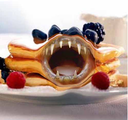
Photoshop Project #1: Angry Pancakes

    Making these scary pancakes was not as difficult as I thought it would be. I completed this activity while listening to Mr. Sands give step-by-step instructions that were easy to follow. To start the project I edited the original picture of the pancakes to make room for the scary mouth. Then, I pasted the fish face onto the pancakes and cropped out the area that was not necessary. Finally I changed the color of the mouth so it would look more realistic with the pancakes and I centered it appropriately. The hardest part of this project was stretching out the pancakes to make room for the mouth because it was challengiing to make it look completely normal. I enjoyed this project because I thought the concept was funny of the food eating the person instead of the other way around.

Monday, March 18, 2013

Stencil Project

     This experience was quite fun because I got to use spray paint, which I had never used before. The process getting to the picture above was long though. First, I went into photoshop and edited the picture, so it would only be four colors. The next step was to trace and cut out stencils for each of the colors. After painting the cardboard background I was ready to spray paint. I took a little bit longer than everybody else because the picture above is of my second try on this project. My first piece was not up to par, due to the spray paint running, so I tried again and it turned out to be a great decision. The strong contrast between the black and white really gives the picture an unexpected look. I belive that I succeeded in this picture because all of the colors go together well. Another reason I succeeded in this project was that, despite setbacks, I managed to create a piece that I am extremely proud of.

Tuesday, February 26, 2013

Contour Line Drawing

My  contour line drawing skills increased greatly from the beginning of this unit. When I started out, I was unsure of myself because I am so used to picking up the pen/pencil and moving around. Also, I typically   don't draw in such fluid motions because I am a "sketchy" kind of artist. Slowly and steadily though I learned how to move my hand at the speed of my eye so I could draw exactly what I see. In this drawing I did a good job of capturing all of the little details of the shoe. On the other hand, I made several obvious mistakes like making the bottom of the shoe unproportionally large. The laces are another fault because they are too fat. I improved throughout the contour drawing unit, sadly, I do not believe that this is my best piece of work from this unit.

Monday, February 11, 2013

iPad Value Study


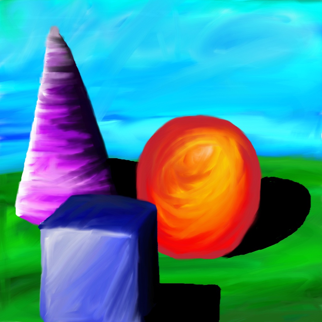
     There is a big difference between using oil pastels and using the Layers Pro App on the iPad.  For starters, using oil pastels in much messier than using the iPad.  Also, it is much easier to blend colors on the iPad because the App allows you to blend using your fingers.  There are some similarities because both the iPad and oil pastels produce an image with very vibrant colors.  Another similarity is that you can layer your picture to make it look like your shapes are sitting on different levels.  This experience taught me how to use Layers Pro App and how to blend colors together to create value.  I believe that this is my strongest piece from the value studies unit because I blended the colors well so there is no banding of colors.  Technology is useful in art because it helps students create art in a more innovative and modern fashion. 

Wednesday, January 30, 2013

Cartoon Skeletons Drawing

     My cartoon was of the Nintendo character, Luigi, jumping into the air. I believe that the majority of the bones came out normal and proportional to his body.  All of the primary bones are shown in my drawing including the jaw bone which I normally forget is separate from the skull when I am drawing.  I also included joints in Luigi's knees and elbows which was hard to do because his arms and legs are so fat.  The toughest part of this drawing was his arms because they are short and stubby which makes it hard to draw natural, human-like bones.  I had to get creative when drawing his rib cage because his stomach puffs out so I have to widen his rib cage in certain areas.  Hopefully, my creativity allowed me to capture Luigi's disproportional and awkward skeleton well.