Monday, March 18, 2013

Stencil Project

     This experience was quite fun because I got to use spray paint, which I had never used before. The process getting to the picture above was long though. First, I went into photoshop and edited the picture, so it would only be four colors. The next step was to trace and cut out stencils for each of the colors. After painting the cardboard background I was ready to spray paint. I took a little bit longer than everybody else because the picture above is of my second try on this project. My first piece was not up to par, due to the spray paint running, so I tried again and it turned out to be a great decision. The strong contrast between the black and white really gives the picture an unexpected look. I belive that I succeeded in this picture because all of the colors go together well. Another reason I succeeded in this project was that, despite setbacks, I managed to create a piece that I am extremely proud of.

Tuesday, February 26, 2013

Contour Line Drawing

My  contour line drawing skills increased greatly from the beginning of this unit. When I started out, I was unsure of myself because I am so used to picking up the pen/pencil and moving around. Also, I typically   don't draw in such fluid motions because I am a "sketchy" kind of artist. Slowly and steadily though I learned how to move my hand at the speed of my eye so I could draw exactly what I see. In this drawing I did a good job of capturing all of the little details of the shoe. On the other hand, I made several obvious mistakes like making the bottom of the shoe unproportionally large. The laces are another fault because they are too fat. I improved throughout the contour drawing unit, sadly, I do not believe that this is my best piece of work from this unit.

Monday, February 11, 2013

iPad Value Study
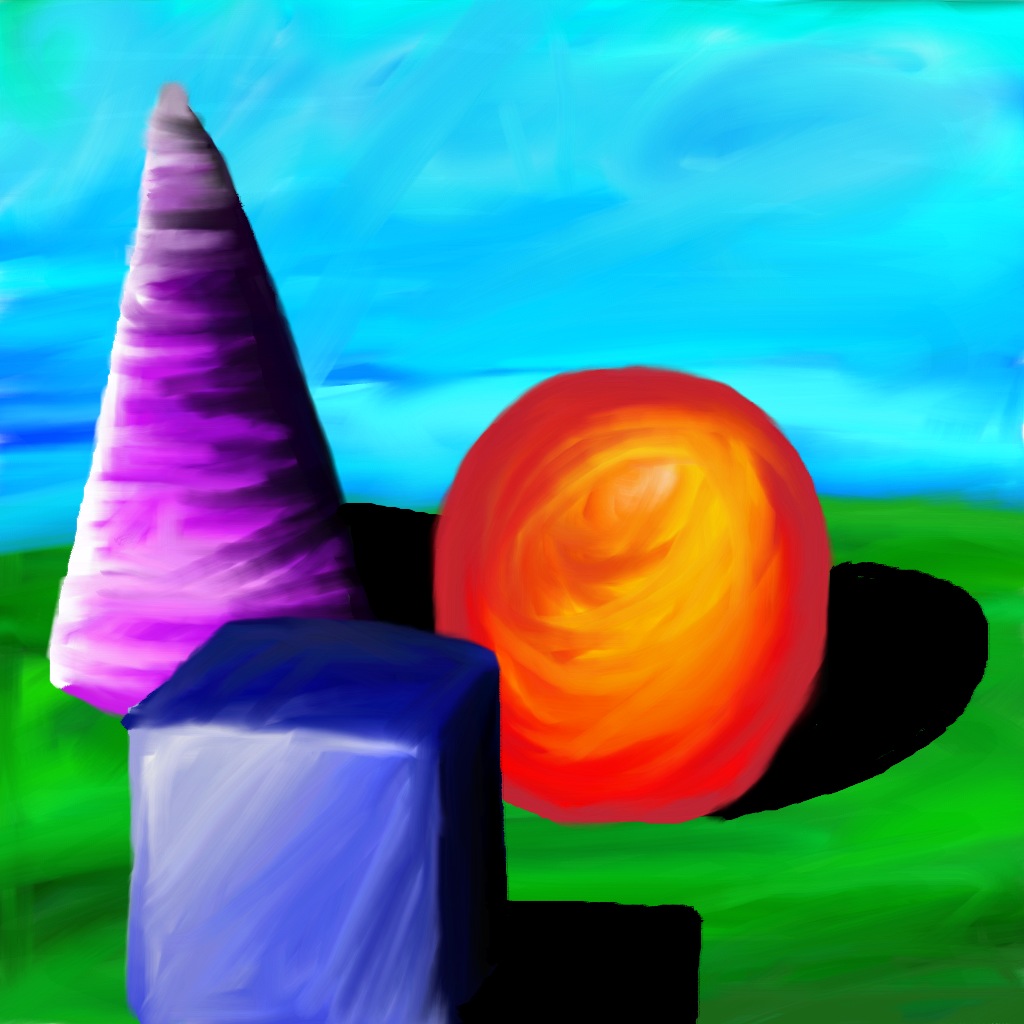

     There is a big difference between using oil pastels and using the Layers Pro App on the iPad.  For starters, using oil pastels in much messier than using the iPad.  Also, it is much easier to blend colors on the iPad because the App allows you to blend using your fingers.  There are some similarities because both the iPad and oil pastels produce an image with very vibrant colors.  Another similarity is that you can layer your picture to make it look like your shapes are sitting on different levels.  This experience taught me how to use Layers Pro App and how to blend colors together to create value.  I believe that this is my strongest piece from the value studies unit because I blended the colors well so there is no banding of colors.  Technology is useful in art because it helps students create art in a more innovative and modern fashion. 

Wednesday, January 30, 2013

Cartoon Skeletons Drawing

     My cartoon was of the Nintendo character, Luigi, jumping into the air. I believe that the majority of the bones came out normal and proportional to his body.  All of the primary bones are shown in my drawing including the jaw bone which I normally forget is separate from the skull when I am drawing.  I also included joints in Luigi's knees and elbows which was hard to do because his arms and legs are so fat.  The toughest part of this drawing was his arms because they are short and stubby which makes it hard to draw natural, human-like bones.  I had to get creative when drawing his rib cage because his stomach puffs out so I have to widen his rib cage in certain areas.  Hopefully, my creativity allowed me to capture Luigi's disproportional and awkward skeleton well.